
Communication Linguine
Docs that drive ROI
Seven years ago I was hired by the Broad Institute’s Data Sciences Platform (DSP) to write documentation for Terra—a cloud-native biomedicine platform that DSP was developing as part of an NIH initiative. But what I really did was transform how users discover and learn to use the platform, while ferreting out inefficiencies and identifying where docs and communication could boost the bottom line. In this post, I’ll walk through some of the highlights of my journey, describing some problems I tackled with communication solutions. Maybe a similar approach could help unblock your challenges, too.
The Challenge
Terra’s a platform designed to store, organize and analyze biomedical data – no matter what shape or size it is. Terra handles Petabytes of genomic data, plus clinical and demographic data for hundreds of thousands of study participants and analyses from batch jobs that take days to run to interactive Jupyter notebooks running on Spark clusters. It’s the everything-and-the-kitchen-sink of Big (bio)Data platforms: built to serve users from computational biologists to clinicians no matter what their cloud or coding background and analysis preference.
It’s meant to simplify moving data and analysis to the cloud, but it’s not a simple platform. All those different users and analysis and data modes mean there is no typical onboarding path. And the engineers who develop the platform don’t really speak the same language as many of the clinicians, researchers and public health orgs who use it.
So writing and organizing the documentation–for a tool that’s supposed to make working in the cloud an easier lift–was not an easy lift. This was especially true for onboarding documentation that served our first-time users who weren’t familiar with cloud analysis or maybe even coding.
Making docs actually useful
The technical trnslating itself was easy. I’m really good at translating software developer jargon to easy-to-understand docs and instructions and my science background means I’m a stickler for getting the details right. I haven’t met a science concept yet that I can’t explain to my 70 year old mom or my 7 year old kids. Feedback from colleagues and end-users consistently says the docs I write are very understandable and straightforward.
“The documentation [Allie] creates is consistently excellent… presented in a clear, succinct, easily understandable way.” – From a 2025 performance review.
Improving overall writing and readability
Low hanging fruit was keeping sentences shorter and using shorter words, removing redundant information and breaking up text walls with clear headers. I’ve been a huge fan of grammarly.com and hemmingwayapp.com for making content is concise and correct, and I’ve used it extensively to write and edit articles for years.
But I knew great documentation was more than just clear and concise writing. When creating and editing articles, I also wanted to make them easier to read using all the non-word tricks and tips possible. The fact that I’m jazzed up about graphic design and collaboration helped, too.
I worked with our writing team and UX designers on implementing customizations to our support theme to help (I’ve included all the gory details below!).
Calling attention without distracting
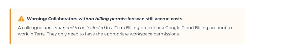
Callouts highlight important concepts without disrupting the overall flow of the doc. We used them for helpful hints (💡things some users can skip over) and warnings (⚠️things that often trip up users). We used these to draw attention to common gotchas we knew from the Frontline team.
example callout: hints

example callout: warning
Keeping niche details available but out of sight
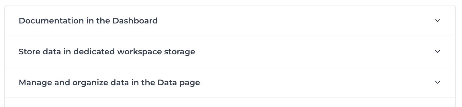
The platform’s complexity meant that docs could balloon to many many pages to scroll through. Collapsible sections keep articles from getting too bogged down with details most people don’t need (i.e., long) while keeping the information easily available.
Example: Closed sections
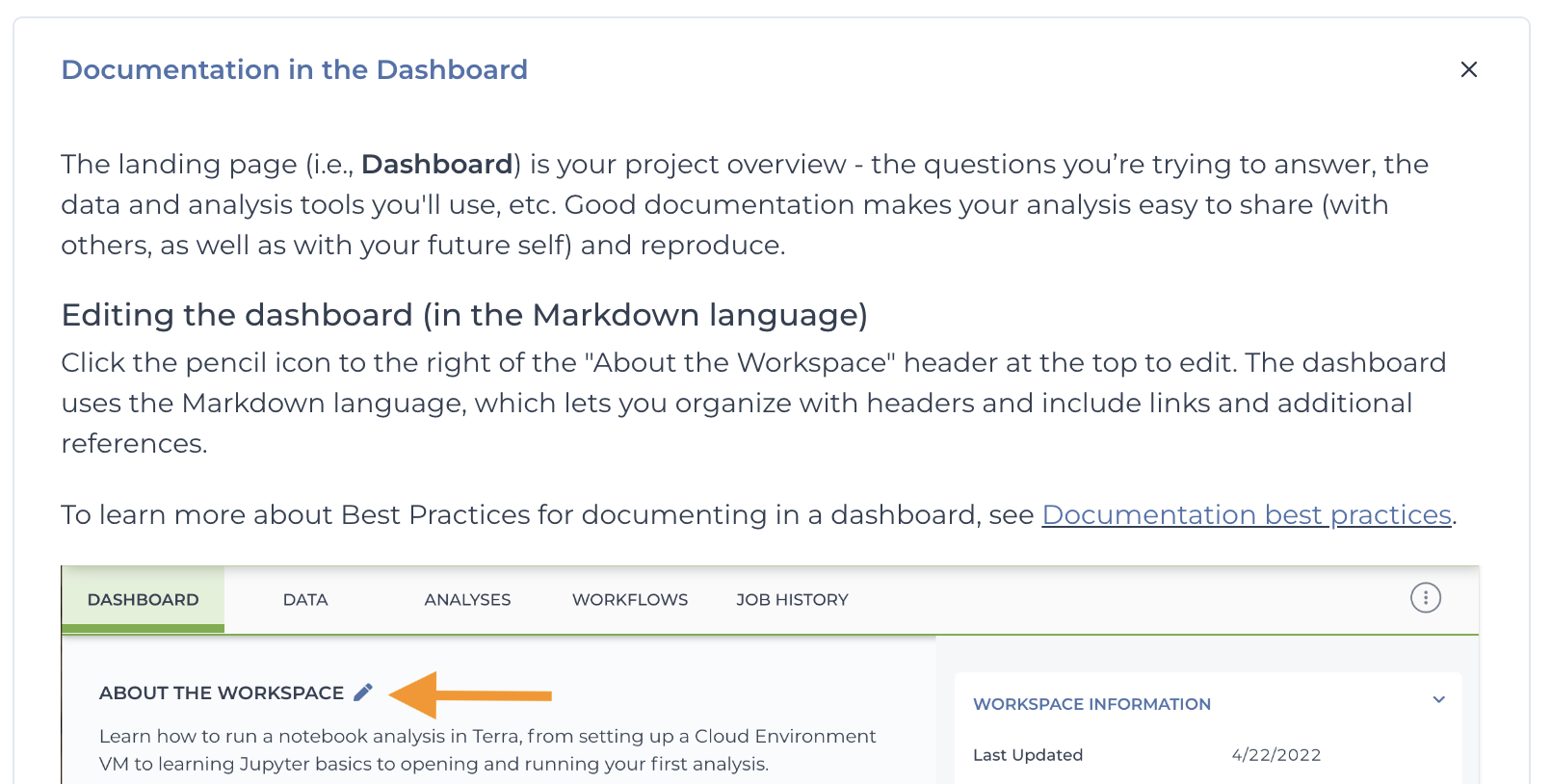
Example: Expanded sections
Presenting different use cases side-by-side
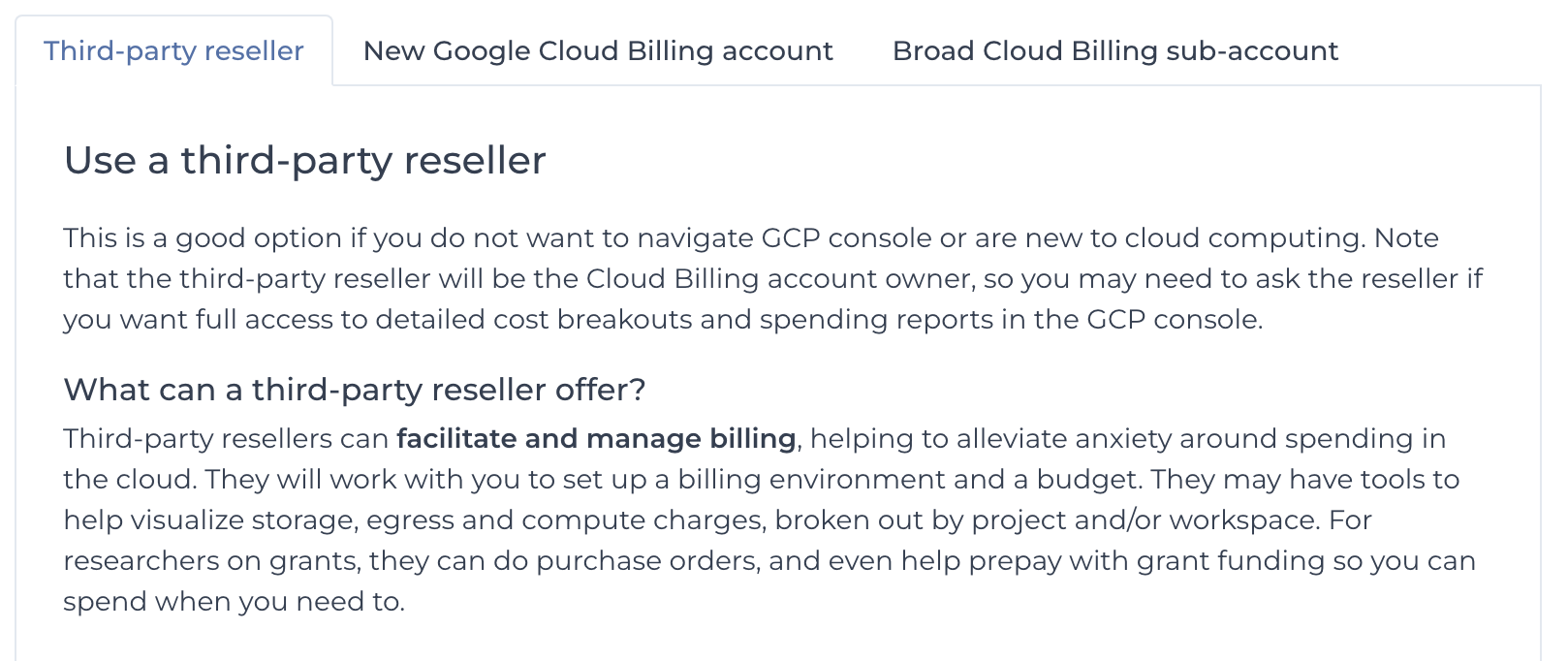
When there were two or more different paths for different people, tabs make instructions for each option easily available while hiding information that’s not relevant for everyone.
Solving the search problem
I knew even the best-written docs won’t make a difference for customers who can’t find the information they need easily and quickly. No one wins when users are frustrated and support is wasting their time directing people to existing articles people can’t find on their own. I spearheaded a number of team efforts that increased doc findability and saved frontline hours of time and $200k/year, freeing these resources for other efforts.
Thinking like a user, not a developer
If software engineers or subject matter experts (SMEs) are writing the docs, they’ll organize them in a way that makes sense to them. Initially Terra Support docs were grouped by back-end similarity rather than by how people used the product.
Researchers didn’t care about how to use a screwdriver or a nail gun. They just wanted to know how to do the thing they wanted to do.
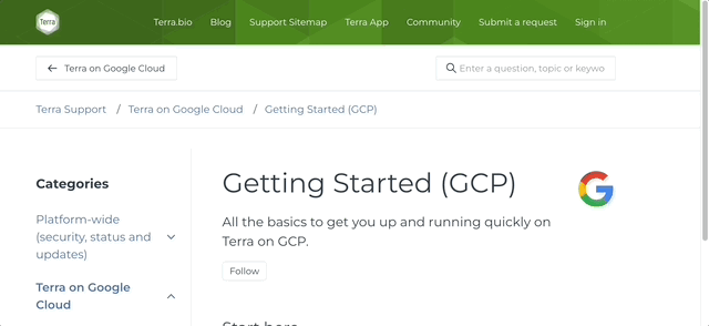
My first week working on support.terra.bio, I reorganized the documentation by use-case, grouping by functionality and using vocabulary familiar to researchers, not software engineers. The support table of contents was more helpful if it mirrored their needs, with sections like Getting Started, Data, and Workflows.
Improving native search results
But not everyone finds information by following the sitemap tree, and the knowledge base search was almost unusable. A search would generate hundreds of hits, many from old service alerts or community forum threads, most of which weren’t useful. Often the article that answered the exact question existed but was buried on page 11 of the search results. Our support team spent 80% of their time directing people to existing articles they couldn’t find themselves.
I spearheaded a team effort to optimize our docs for search functionality (based on the native Zendesk search hierarchy). The impact: Support questions dropped from 80% to 25%, freeing frontline to focus on complex problems.
Boosting search with AI search functionality
Recently, I integrated AI-assisted search that lets users ask natural language questions and get summaries with relevant doc links—dramatically improving information discovery.
Meeting users where they are (in the platform)
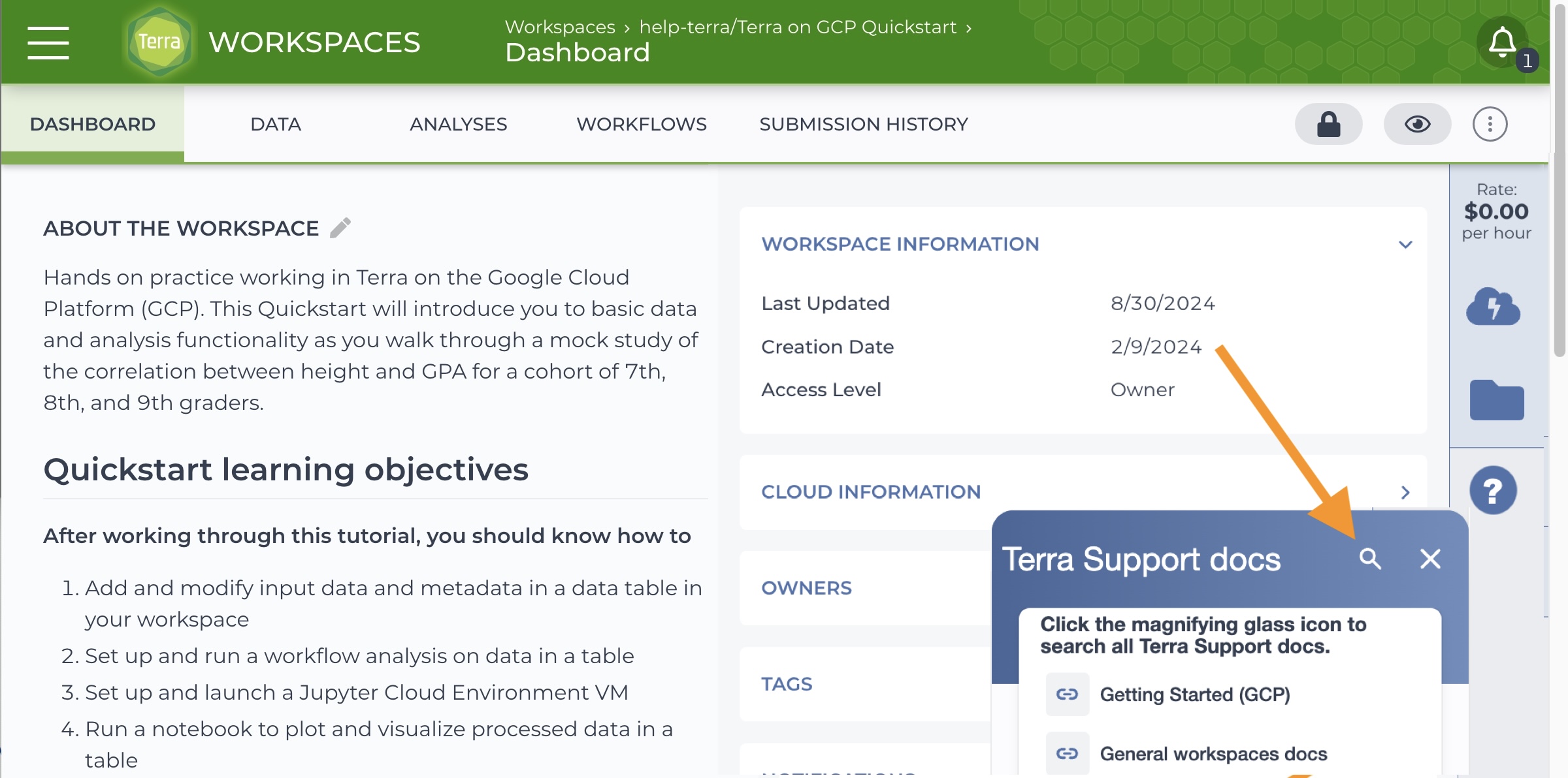
Helping users help themselves with a search that was built into the platform has been a dream of mine for years. Finding support docs from in Terra required four clicks through confusing menus (possibly one reason users couldn’t find the docs they needed themselves??), but adding in-app support to the platform UX was always eclipsed by other engineering priorities. So I designed an in-app solution using Appcues as a workaround.
A universal support icon on every page (orange arrow at right)
reveals relevant articles. Note that clicking on the magnifying glass (indicated by an arrow below) exposes a field for searching Terra Support docs right from the workspace.
The Bottom Line – Documentation as a business driver
Happy users become return customers who spread the word about your product. By making Terra support docs more useable and discoverable, I helped grow our customer base and increase customer satisfaction while reducing support overhead—turning documentation from a necessary evil into a growth driver.
Does your business model rely on explaining complex ideas to investors or instructing end-users on a complex process or platform that’s different from what they’ve used in the past? If you need to bridge the gap between tech people and people in general, you may be looking for a communication specialist or documentarian.